The return of bell bottoms is not just a fashion headline, it is a clear signal that ’70s style is resonating again. As bell bottom jeans are actually back, designers are leaning into the same nostalgic mood with color. You can tap into that energy overnight by reintroducing a handful of classic ’70s hues in paint, textiles, and furniture.
1) Harvest Gold — framing a ’70s kitchen staple as the warm, retro counterpart to the bell bottom jeans comeback
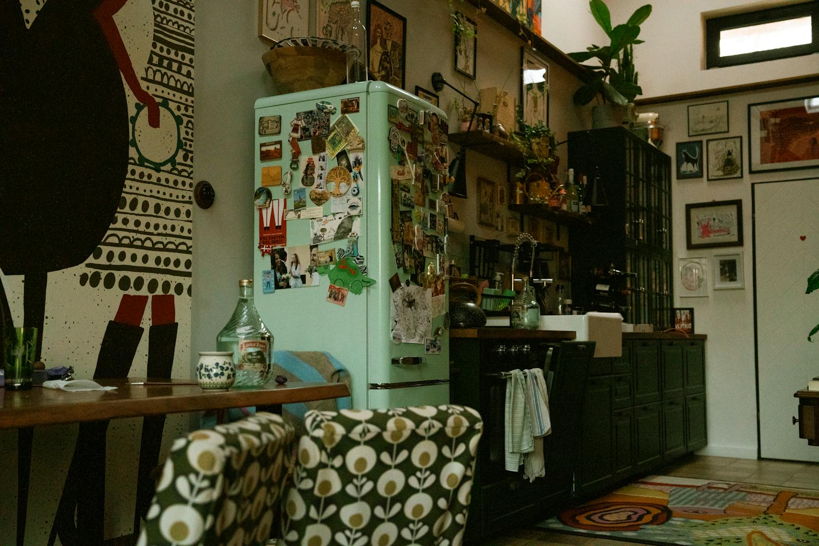
Harvest Gold instantly recalls vintage ranges and refrigerators, and it fits naturally into the renewed appetite for ’70s style signaled by the return of bell bottoms. When you see that Harvest Yellow is still being name-checked alongside Avocado Green and Burnt Orange in nostalgia conversations, it is clear this color never fully left the cultural memory. Designers are now channeling that familiarity into cabinetry, tile, and small appliances that feel retro but not kitschy.
In practice, Harvest Gold works best as a warm anchor in spaces that might otherwise skew cold or minimal. A bank of matte gold cabinets, a ceramic backsplash, or even a single statement pendant can echo the same throwback confidence that makes flared denim feel fresh again. For homeowners, the stakes are simple: a carefully placed hit of this color can make a kitchen or dining nook look curated and current, without a full renovation.
2) Avocado Green — positioning this nostalgic hue as the interiors echo of bell bottom jeans returning
Avocado Green is one of the most recognizable colors of the era, and its comeback tracks closely with the renewed interest in bell bottoms. Vintage-focused sources describe how Avocado took root in home design in the 1960s and early ’70s, introduced alongside other nature-inspired hues. Today, that same earthy quality is what makes it appealing again, especially as people look for ways to bring the outdoors in.
Designers are using Avocado Green on walls, sofas, and kitchen accents to create enveloping, saturated rooms that still feel grounded. A single upholstered chair or a painted pantry door can nod to the past without overwhelming the space. For you, the implication is that this color can bridge eras, pairing just as easily with sleek stone and stainless steel as with vintage wood, much like bell bottoms pair with both sneakers and tailored blazers.
3) Burnt Orange — tying this bold accent shade to the same ’70s mood that makes bell bottom jeans feel current again
Burnt Orange is another color that surfaces repeatedly in conversations about ’70s design, often mentioned right alongside Avocado Green and Harvest Gold. In one nostalgic thread, people recall Burnt Orange as a defining shade of the decade, the answer to the question “What was the ’70s orange color called?” That collective memory mirrors the way bell bottoms have reentered wardrobes, not as a novelty, but as a familiar favorite.
In interiors, Burnt Orange thrives in textiles, rugs, and upholstery where its depth can play against neutrals. A wool area rug, velvet cushions, or patterned curtains in this shade can warm up a white box apartment overnight. The broader trend matters for anyone decorating on a budget: by swapping in a few Burnt Orange accents, you can tap into the same retro energy driving flared denim, without committing to permanent changes.
4) Mustard Yellow — casting it as a playful, fashion-forward neutral aligned with the bell bottom jeans revival
Mustard Yellow sits between sunny and earthy, which makes it a natural partner for the ’70s revival that bell bottoms represent. Contemporary color commentary points out that Color is a powerful way to bring the ’70s into 2025, specifically calling out Orange, avocado green, and mustard yellow as shades that were “all the rage back then.” That same trio is now reappearing in interiors as designers search for alternatives to gray and stark white.
Used strategically, Mustard Yellow behaves like a playful neutral, especially on accent chairs, headboards, or patterned bedding. It can soften dark woods, energize beige, and sit comfortably next to denim blue, echoing the way bell bottoms often pair with mustard-toned knits. For renters and homeowners alike, the implication is that a single mustard lamp, throw, or ottoman can signal that you are tuned into current design conversations without overwhelming your space.
5) Chocolate Brown — presenting it as the grounding ’70s base note rising with the bell bottom jeans trend
Chocolate Brown is emerging again as a deep, soothing backdrop, just as flared denim reclaims closet space. One guide to retro palettes notes that Chocolate Brown keeps things from getting too loud when paired with bolder ’70s hues, a role it played decades ago and is reprising now. That grounding quality is exactly what makes it valuable in rooms that lean into saturated color.
Designers are applying Chocolate Brown in wood finishes, leather sofas, and even wall paint to create cocooning spaces that still feel sophisticated. When you combine it with orange or mustard accents, you get a palette that reads intentionally retro rather than dated. The stakes for design-minded homeowners are clear: embracing this shade can make adventurous color choices feel balanced, much like a classic brown belt or boot steadies an outfit built around statement bell bottoms.
6) Rust Red — linking this moody, earthy red to the same retro comeback that put bell bottom jeans back in rotation
Rust Red, often grouped with terracotta, is another color riding the wave of ’70s nostalgia that bell bottoms exemplify. A detailed look at period-inspired schemes highlights Rust Red and Terracotta as warm, textured hues that feel “instantly vintage.” That description captures why designers are turning to them now, especially in spaces that aim for a collected, global look.
In your home, Rust Red can show up on accent walls, ceramics, or patterned textiles like kilim pillows and runners. The color’s slightly muted quality keeps it from feeling aggressive, even when used generously. For anyone watching trends, the key takeaway is that Rust Red offers a way to participate in the ’70s color comeback with a shade that still feels grown-up, echoing the way bell bottoms can look polished when styled with tailored pieces.
7) Camel and Caramel — treating these warm neutrals as the sophisticated side of the bell bottom jeans resurgence
Camel and Caramel function as the refined neutrals of the ’70s palette, and they are resurfacing alongside more saturated tones. A recent look at classic hues notes that Classic colors like chocolate brown and terracotta are making a comeback in home decor because they add warmth and timelessness. Camel and Caramel sit comfortably in that same family, offering a softer alternative to stark black-and-white schemes.
Designers are leaning on these shades in upholstery, drapery, and rugs to create layered, tonal rooms that still nod to the decade of bell bottoms. A caramel leather sofa, camel wool rug, or linen curtains in a sandy hue can modernize vintage pieces while keeping the palette cohesive. For you, the implication is that these neutrals are a low-risk entry point into the ’70s revival, signaling trend awareness without committing to bold color on the walls.
8) Denim Blue — directly connecting this classic ’70s shade to the literal return of bell bottom jeans
Denim Blue is the most literal bridge between interiors and the verified fashion comeback of bell bottoms. With ’70s paint color trends emphasizing bold, vibrant hues like avocado green to warm up spaces, it makes sense that designers are also echoing the familiar blue of jeans in paint, tile, and textiles. The color feels casual and approachable, which is exactly why it works so well in both wardrobes and rooms.
In decor, Denim Blue can appear on kitchen cabinetry, bathroom tile, or woven throws, instantly tying a space to the same relaxed, nostalgic mood that makes flared denim appealing again. Paired with Mustard Yellow, Burnt Orange, or Chocolate Brown, it creates a palette that feels pulled straight from a ’70s street scene. For anyone updating a home, embracing Denim Blue is a direct way to align interiors with the confirmed return of bell bottom jeans and the broader revival they represent.
Leave a Reply