Designers know that the difference between a magical Christmas room and a messy one usually comes down to how textures are layered, not how much decor is crammed onto every surface. The goal is to stack greenery, metals, fabrics, and sparkle in a way that feels intentional, so the eye glides through the space instead of ping-ponging between random ornaments. With a few pro-level habits, anyone can build those layers and still keep the room calm, cohesive, and easy to live in all season.
The secret is to think like a stylist: start with a clear color story, choose a couple of hero textures, then repeat them in smart ways from the tree to the mantel to that one corner that always ends up in family photos. Once the structure is in place, the fun details, from velvet bows to hammered metal, can slide in without tipping the whole look into chaos.
Start with a calm base: color, greenery, and one focused zone
Every polished Christmas scheme starts with restraint, not with the ornaments. Pros lock in a palette first, then let that decision rule everything from ribbon to wrapping paper so the textures have a shared backdrop instead of competing for attention. Guidance on how to Choose a Color Palette and Stay Faithful to it leans heavily on pairing natural greens with neutrals and repeating the same tones around the room, which instantly cuts visual noise. Once that base is set, even bold textures like sequins or chrome feel curated instead of loud, because they are all speaking the same color language.
Designers also resist the urge to decorate every inch of the house, which is where many homes tip into clutter. A smart shortcut is to Start With One Corner and Forget the idea that Christmas has to land on every surface, then Choose one small spot and let it carry the mood. That might be the tree wall, a console by the entry, or a fireplace zone that can handle more layers. By concentrating the richest textures in a dedicated area and keeping the rest of the room lighter, the space feels styled instead of stuffed, and the eye gets a clear focal point to rest on.
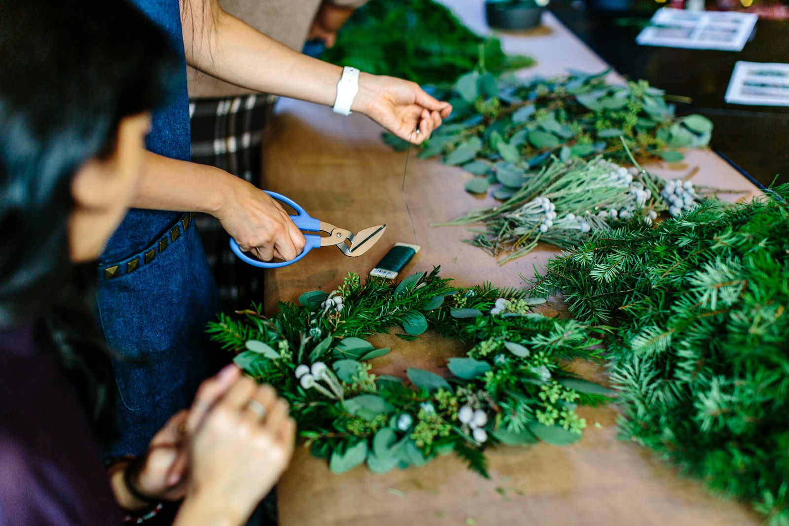
Layer textures like a pro on the tree and mantel
On a designer tree, texture starts with structure, not with the tiniest ornaments. Stylists often Pick 2 (or 3) Base Florals in colors that are similar, using larger greenery or berries as the first layer that visually fills the tree. A more detailed breakdown of how to Pick Base Florals explains that these fuller stems create the volume, so later layers only need to add interest, not bulk. Once that foundation is in, designers follow with ribbons, then ornaments in deliberate passes, which keeps the look lush but still readable from across the room.
Order matters just as much as ingredients. Professional tree designers are adamant that anyone who wants a polished look should Start with a Theme or Colour Palette, then place the largest ornaments deep in the branches before layering in smaller pieces. Video tutorials that share how to create a tree that feels full, layered, and intentional often say to Start with your largest ornaments, then use medium and small ones to tie the whole look together. Another pro reel on trimming a tree like a pro stresses that Layering is the secret to a show-stopping holiday look, starting with lights and building out, so each pass adds depth instead of clutter.
The same logic applies to the mantel, where texture can easily tip into chaos if every object is shouting. Calm, modern schemes rely on Micro-Texture Contrasts, using One of the quiet but powerful strategies of layering small differences in finish, like matte ceramics next to brushed metal, so the display feels rich without becoming noisy. Current trend reports highlight Natural and organic touches Creating a sense of warmth and calm, with greenery, wood, and brushed, hammered or matte accents that soften all the sparkle. When those organic pieces are repeated from the tree to the mantel, they act like a visual thread that keeps the whole room feeling intentional.
Mix fabrics, finishes, and collections without visual overload
Once the big surfaces are set, the smaller layers are where personality shows up, and this is where designers lean hard on texture. Guidance on Best ways to layer textures calls out combinations like soft velvet bows, crisp paper ornaments, glittery garlands, and shiny chrome accents, which create contrast through feel as much as through color. Color experts also suggest Weave in different tones and textures, like blue linen or jute, navy velvet, and pops of pastel in Yuletide schemes, so the palette stays sophisticated even when the materials are playful. The trick is to repeat each texture at least two or three times around the room, so nothing feels like a random outlier.
Collections are another potential clutter trap that designers flip into a feature by giving them structure. Instead of scattering figurines or vintage ornaments everywhere, stylists lean on En Masse Collections and Choose a Dedicated Space, then Select a mantel, console, or shelf where the group can live together. Concentrating similar pieces in one spot turns them into a single, strong layer of texture, which is far easier on the eye than dozens of tiny moments scattered across the room. When that dedicated zone echoes the same greenery, metals, and fabrics used on the tree and mantel, the whole house reads as one cohesive design instead of a patchwork of holiday clutter.
More from Wilder Media Group:
Leave a Reply