Of all the rooms in a house, the kitchen is the one people research the longest and still second-guess the most. It’s also the most expensive room to redo, which means a choice that looked great on a mood board can feel like a permanent regret once the dust settles and the bills arrive. Kitchens remain the most popular remodeling project homeowners take on, and a National Association of Realtors report on remodeling satisfaction found that even well-executed kitchen updates don’t always deliver the joy homeowners expect going in.
Trends move fast in kitchens, faster than almost anywhere else in the house, and some choices simply don’t age or function as well as they photograph. Here are ten kitchen decisions homeowners commonly say they’d take back if they were starting over.
Open Shelving Instead of Upper Cabinets
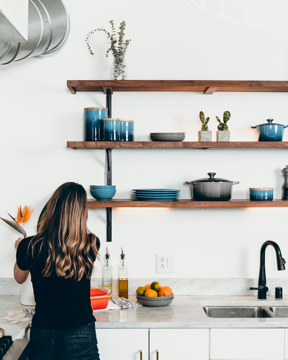
Open shelving looks airy and curated in photos, styled with a handful of matching dishes and a single plant. In real daily life, it means every plate, mug, and cereal box is on permanent display, collecting grease and dust from cooking. Homeowners who make the switch often find themselves either obsessively organizing shelves before guests arrive or quietly wishing they’d kept at least some closed storage for the unglamorous everyday items. Dust accumulates noticeably faster on open shelves near a stove, and the exposed dishware needs far more frequent washing even when unused. Many end up adding cabinet doors back within a few years, which costs more than simply keeping the uppers in the first place.
An All-White Kitchen With Light Grout
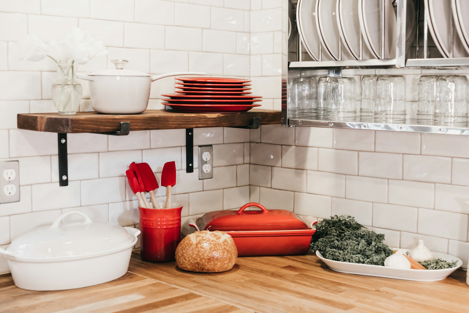
A crisp white kitchen photographs beautifully and remains a design classic for good reason. But white countertops, white cabinets, and especially light-colored grout show every coffee drip, tomato sauce splash, and scuff almost immediately. Grout in particular is porous and stains easily if it isn’t sealed regularly, and homeowners often find themselves scrubbing lines between tiles far more than they anticipated. It’s not that white kitchens are a mistake exactly, but many homeowners wish they’d chosen a mid-tone grout or a slightly warmer white that hides daily wear rather than broadcasting it. A kitchen used for actual cooking, not just staging, needs surfaces that forgive a little mess.
A Farmhouse Sink That’s Too Shallow
The deep, apron-front farmhouse sink has become a near-default choice in kitchen renovations, but not every version is created equal. Shallower farmhouse sinks splash water onto the floor and counter constantly, and some models are surprisingly hard to fit a full sheet pan or stockpot into despite their large footprint. Homeowners who chose a farmhouse sink mainly for the look, without checking the actual basin depth, often regret it the first time they’re washing large dishes. The style itself isn’t the problem so much as picking one without testing its everyday function, which is easy to overlook when you’re comparing finishes and faucet pairings instead of actually using the sink.
Matte Black Fixtures Everywhere
Matte black faucets, cabinet hardware, and light fixtures had a long moment as the go-to way to modernize a kitchen. The catch many homeowners discover afterward is that matte black shows water spots, fingerprints, and hard-water mineral buildup more visibly than chrome or brushed nickel, and it can be genuinely difficult to clean without leaving streaks. Some finishes also wear unevenly over time, developing a patchy look at high-touch points like faucet handles and cabinet pulls. It still looks striking when new, but homeowners who live with it daily often wish they’d chosen a finish that hides fingerprints better, especially in a house with kids or a busy household touching everything constantly.
A Waterfall Quartz Island Edge
The waterfall edge, where countertop material wraps down the sides of an island in one continuous slab, is a striking, expensive upgrade. It’s also one of the priciest details in a kitchen renovation and one of the hardest to repair if it chips or cracks, since matching the seam invisibly requires cutting into an already-installed slab. Homeowners sometimes find that the dramatic visual impact doesn’t get noticed as often in daily life as they expected, especially once bar stools or a trash pull-out are tucked against it. It’s not a bad feature, but it’s one where the cost-to-payoff ratio disappoints more people than most other high-end kitchen upgrades.
Removing the Pantry for Open Concept
Knocking down walls to create one continuous open-concept space has been a dominant renovation trend for years, and pantries are sometimes sacrificed in the process to make room for a bigger island or more open floor space. Homeowners frequently regret this once they realize how much everyday storage a pantry actually provided, from bulk pantry goods to small appliances that otherwise clutter the counters. Open shelving or a butler’s pantry can sometimes recapture some of that storage, but it rarely matches what a dedicated closet or walk-in pantry offered. Storage tends to be one of those things people underestimate until it’s gone, and by the time they notice, it’s an expensive fix to add back.
An Island Too Small to Actually Use
Islands are one of the most requested kitchen features, but a lot of homeowners end up with one sized more for the room’s proportions than for real function. An island too narrow for comfortable seating, or too small to hold both prep space and a sink or cooktop, ends up feeling more decorative than useful. People often say they wish they’d prioritized function over symmetry when planning the layout, since a slightly awkward but larger island beats a perfectly centered one that can’t fit two people cooking at once. Getting this right usually means mocking up the space with painter’s tape before committing to cabinetry, which is a step many skip in the excitement of planning.
Trendy Two-Tone Cabinets
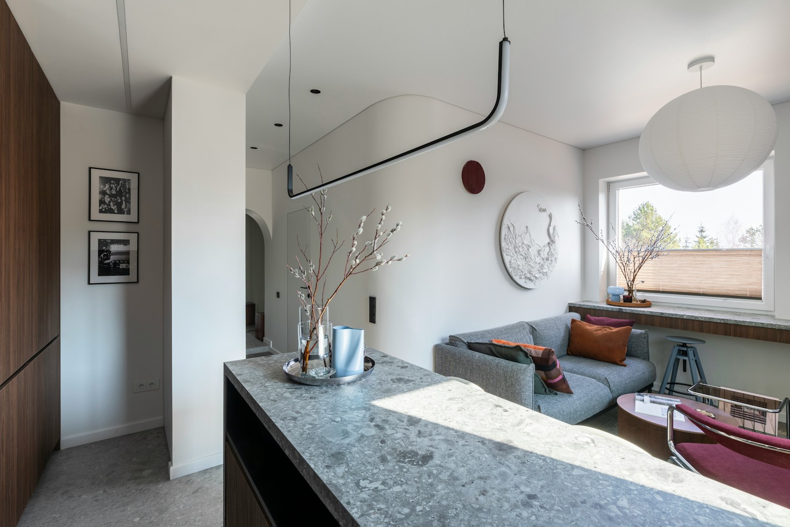
Pairing a dark lower cabinet color with a lighter upper, or vice versa, has been a popular way to add visual interest to a kitchen. Like many trend-driven choices, it can date a kitchen to a specific few years faster than an all-one-color scheme would. Homeowners who chased a particular trending combination sometimes find themselves wanting to repaint within just a handful of years, which is a costly redo for cabinetry that would otherwise last decades. A more timeless approach, choosing one main cabinet color with visual interest introduced through hardware, a tile backsplash, or an island in a contrasting tone, tends to hold up better as tastes shift.
A Pot Filler Above the Stove
The pot filler faucet mounted above the range looks professional and promises to save trips back and forth to the sink with a heavy, full pot of water. In practice, many homeowners report using it only occasionally, since it still requires carrying the empty pot to the stove first and it adds another fixture that needs cleaning and, eventually, maintenance. It’s a genuinely nice-to-have for people who cook large batches often, but for an average household, it’s frequently cited as an upgrade that cost more in plumbing work than the convenience delivered. It’s one of those features that looks impressive to buyers touring the house but gets used far less than expected day to day.
Undersized or Poorly Placed Outlets
It’s easy to focus a kitchen redesign on finishes and forget the unglamorous electrical planning underneath it. Homeowners commonly wish they’d added more outlets, or placed them more thoughtfully, once they’re living with a coffee station, a mixer, and a toaster all fighting for the same two plugs. Outlets tucked in awkward spots behind heavy appliances or hidden inside cabinets can also be genuinely inconvenient rather than just a minor annoyance. Because rewiring after the fact means opening up finished walls or backsplash, this is one of those decisions that’s cheap to get right during a renovation and expensive to fix afterward, which is exactly why it shows up so often on the regret list.
Leave a Reply