Color is shifting away from cool minimalism and back toward the saturated, nostalgic hues that once defined mid‑century living rooms and 1970s lounges. Designers are leaning into this vintage palette not as a novelty, but as the new foundation for warm, character‑rich interiors. If you want your home to feel current over the next few years, you are better off embracing these retro shades now rather than waiting for the trend cycle to pass you by.
Why Vintage Colors Are Surging Back
The renewed appetite for vintage color is rooted in emotion as much as aesthetics. After years of stark whites and chilly grays, you are seeing a swing toward hues that feel storied, tactile, and lived in. Vintage colors are described as more than just old paint chips, they are framed as shades that “tell a story of a time when every detail was carefully considered,” and that sense of narrative is exactly what many homes have been missing. When you bring in these tones, you are not only updating your palette, you are adding a layer of memory and meaning that can make even a new build feel grounded and personal, which is why advocates say these hues can lend a room a “timeless dimension” rather than a fleeting seasonal look, as highlighted in guidance on vintage colors.
At the same time, the broader color conversation is moving toward warmth and depth, which naturally favors retro‑leaning shades. Forecasts for interiors in 2025 point to palettes that are “rich and warm,” with designers calling out greens that feel enveloping rather than minty, and “zesty reds” that read more like tomato and paprika than neon, a shift captured in reporting on interiors color trends. When you combine that with the way vintage tones echo the colors of aged leather, patinated brass, and sun‑faded textiles, it becomes clear why this palette is not a niche throwback. It is the natural next step for anyone tired of flat, cool neutrals and ready for rooms that feel more cinematic and layered.
The New Neutrals: Earthy, Retro, And Anything But Flat
If you are wondering what is replacing gray, the answer is not a single color but a family of warm, earthy neutrals that would look at home in a 1970s design catalog. Beige has made what one report calls a “remarkable” return, framed as a softer, more forgiving backdrop that is already a popular color in 2025, especially when it leans into sandy, caramel, or mushroom undertones. These updated neutrals are being positioned as the perfect answer for anyone asking what color is replacing gray, because they keep spaces calm while adding the warmth that cooler palettes lacked.
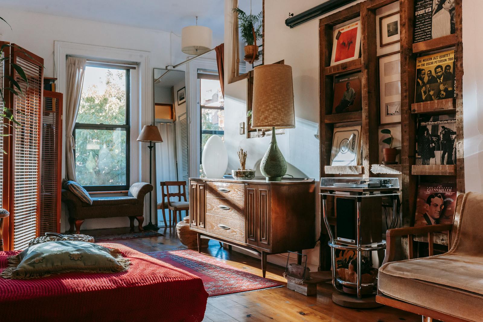
Beyond beige, designers are championing a spectrum of neutral, earth‑inspired colors that feel lifted from vintage ceramics and wool rugs. Guidance on 2025 interiors notes that “neutral, earth‑inspired colors are taking center stage,” explicitly calling out clay‑like terracottas, muted mustards, and midnight blues as the new backbone of sophisticated rooms, a shift detailed in coverage of earth‑tone design trends. These are not the pale greiges of the last decade, they are saturated, slightly moody hues that still behave like neutrals because they pair easily with wood, stone, and metal. When you paint a living room in a deep midnight blue or a soft terracotta, you get the cozy, cocooning effect of color without sacrificing versatility.
Warm, Sophisticated Palettes: Ochre, Oxblood, Teal And Beyond
The most distinctive part of the vintage palette revival is the return of warm, sophisticated colors that once defined mid‑century lounges and 1990s libraries. Designers are calling out ochre, oxblood, and teal as key hues that shaped 2025 and are expected to keep building momentum into 2026, a trajectory underscored in reporting on warm, sophisticated palettes. When you layer these colors together, you get a look that feels both retro and surprisingly polished: think ochre velvet on a sofa, oxblood on a small accent wall, and teal on cabinetry or built‑ins.
Color authorities are reinforcing this move toward enveloping warmth at the highest level. The Pantone Color of the Year 2025 is named “Mocha Mousse,” described as a warm, rich brown with a special intensity that evokes the comfort of coffee and chocolate while signaling stability in uncertain times, as detailed in analysis of color trends 2025. When you pair a Mocha Mousse‑style brown with ochre or oxblood, you get a palette that feels like a vintage club chair or a well‑worn leather bag, instantly adding gravitas to a room. Designers are also leaning into “saturated colors” more broadly, celebrating rich jewel‑box tones like emerald and garnet as a welcome shift away from washed‑out pastels, a point emphasized in commentary on saturated colors. For you, that means it is finally safe to commit to deeper paint colors and upholstery without worrying they will feel dated in a year.
Earth Tones, Art Deco Glamour, And The 1970s Revival
Alongside these browns and jewel tones, earth colors are staging a full‑scale comeback that feels straight out of a 1970s sunken living room. Forecasts for 2025 highlight “warm, earthy tones” like terracotta, rust, ochre, and deep greens as major players, with designers noting that these shades help interiors feel grounded by mimicking the natural world, as outlined in coverage of warm, earthy tones. When you bring these colors into your home through walls, textiles, or tile, you tap into that nostalgic, 1970s palette while still keeping the space firmly in the present through clean lines and modern materials.
Looking ahead to 2026, the vintage story expands into full Art Deco glamour. Designers are already pointing to “Art Deco Design” as a key influence, encouraging you to seize your “Great Gatsby moment” with interiors that embrace rich golds, ochres, and honey tones, as detailed in reporting on Art Deco design. These colors echo the lacquered bars and gilded ceilings of historic theaters, but when you apply them to contemporary lighting, hardware, or accent walls, they read as luxurious rather than costume‑y. The broader 2026 trend conversation reinforces this, noting that color is becoming more sculptural and emotional, with designers using bolder shades to shape how a room feels rather than just to fill in the background, a shift captured in analysis of interior design trends 2026. When you combine earth tones with Art Deco metallics, you get a layered, vintage‑inspired palette that feels both nostalgic and forward‑looking.
From Color Of The Year To Your Living Room
Color of the Year announcements are often treated as marketing moments, but taken together, the latest picks sketch a clear direction that aligns with the vintage palette you are seeing in real homes. Early selections for 2026 include hues like “Warm Eucalyptus” by Valspar, a soft, nature‑inspired green that is framed as versatile enough for any room of your home, as detailed in roundups of Color of the Year picks. When you pair a color like Warm Eucalyptus with Mocha Mousse browns or ochre textiles, you get a palette that feels like a vintage botanical print brought to life, calm but far from bland.
Designers are also signaling that 2026 will reward you for taking more risks with paint, especially in high‑impact spaces like living rooms. Forecasts for that year emphasize that “bolder shades are going to be popular,” explicitly noting that these colors will replace cool grays and beiges and that deep greens, plums, and other saturated hues will show up in living rooms too, as outlined in reporting on living room paint trends. When you see both Color of the Year selections and room‑by‑room forecasts converging on the same family of greens, browns, and warm neutrals, it is a strong signal that these vintage‑leaning shades are not a one‑season experiment. They are the colors you can confidently roll onto your walls now and expect to feel relevant for years.
How To Use Vintage Hues Without Dating Your Space
With so many retro colors in play, the key is to use them in ways that feel intentional rather than theme‑y. One strategy is to treat the warmest shades as accents layered over a grounded, earthy base. Designers talking about “Warm Hues” in 2026 note that the return of cool chromes is being balanced by an uptick in autumnal colors, with one expert celebrating “all that autumnal goodness” in rusts and golds, as captured in coverage of warm hues. You can follow that lead by keeping big surfaces like walls in Mocha Mousse‑style browns or Warm Eucalyptus greens, then layering in ochre pillows, oxblood leather, or brass lighting for that autumnal hit.
Another way to keep your space current is to balance nostalgic shades with contemporary color stories that still feel of the moment. Branding and graphic design forecasts for 2026 highlight trends like “Mermaidcore,” with iridescent aquas and sea‑glass greens, and a renewed interest in electric greens and acid yellows used as sharp punctuation, as outlined in analysis of color trends. Translating that into your home might mean pairing a vintage‑inspired teal sofa with a single acid‑yellow side table or a mermaid‑green glass lamp, so the room feels playful and current rather than locked in a specific decade.
Finally, pay attention to how designers are talking about color as a whole across the next two years. Many are already looking ahead to 2026, where they expect interiors to be dominated by hues that feel expressive and layered, with nothing exciting them more than the chance to experiment with new combinations, as suggested in previews of 2026 color trends. If you start introducing vintage‑inspired colors now, in measured ways that suit your architecture and furniture, you will be ahead of that curve rather than scrambling to catch up. The goal is not to recreate a specific era, but to borrow its best colors and let them evolve in your space, so your home feels both timeless and unmistakably of today.
Leave a Reply