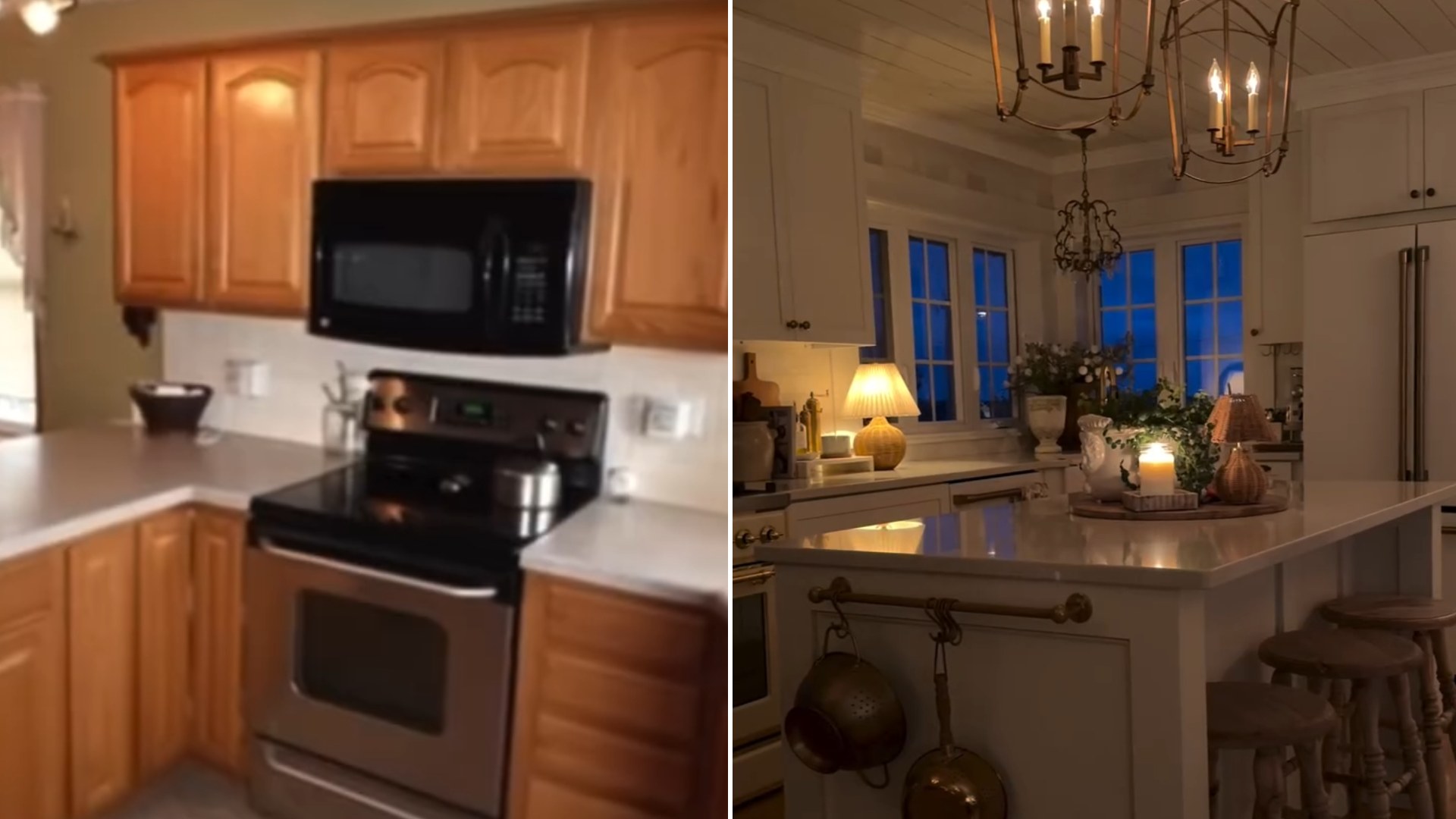
The listing photos that sold her on the house look nothing like the rooms she’s living in now, and that gap is exactly why millions of people stopped scrolling. Homeowner Erica Mueller, who posts as ericamuellerhome to roughly 380,000 followers, set her home’s original Zillow photos directly beside current shots of the same rooms, captioned simply “The Zillow photos vs. now.”
Anyone who has house-hunted online knows the particular mood of a listing photo. The lighting is flat, the furniture is either absent or oddly placed, and every room reads a little smaller and a little sadder than it will once someone actually lives in it. Mueller’s comparison leans directly into that gap, pairing the dated, slightly bleak real estate shots against the same square footage now filled with intentional color, layered textiles, and furniture clearly chosen rather than left behind.
The format itself has become one of the most reliable engines on home renovation social media, and for good reason. A before-and-after doesn’t require narration or a design theory lecture. The split screen does the persuading on its own, and the viewer’s brain fills in the rest of the story about how much time, money, and trial and error sits between the two images.

What separates Mueller’s version from the standard renovation reveal is the source material. Most before-and-afters use a homeowner’s own photos from move-in day, taken after the sale closed and usually after the previous owners had already cleared out. Going back to the actual listing photos, the ones used to market and sell the house to her in the first place, adds a layer most renovation content skips. It’s not just her personal record of progress. It’s the exact images that convinced a buyer, likely including her, that this space had potential worth paying for.
Why Listing Photos Hit Differently
Listing photos carry a strange kind of authority. They’re taken for a transaction, not for inspiration, which means they tend to be honest in ways staged renovation photography usually isn’t. There’s no styling, no curated throw blanket, no bounce card softening the light. Comparing that raw baseline against a fully realized version of the same room does more work than a typical before-and-after, because the “before” wasn’t chosen by the homeowner to make a dramatic point. It was just what the room looked like when it went up for sale.
That authenticity is likely a big part of why the reel, posted on Mueller’s own Instagram, resonated with such a wide audience. Followers of home accounts have grown used to polished transformation content, and there’s a rising appetite for the parts of the process that feel less produced. A grainy MLS photo next to a finished, styled room reads as more credible than a highlight reel, even though both are technically before-and-after shots of the same house.
There’s also a practical lesson buried in the format for anyone currently browsing listings themselves. Houses photographed for sale are almost never shown at their best, and rooms that look cramped, dated, or forgettable online can turn into the most-loved space in the home once someone with a vision and a little patience gets hold of them. Mueller’s rooms didn’t change size or layout in most cases. They changed through paint, lighting, furniture scale, and the accumulated small decisions that don’t show up until someone actually moves in and lives in the space for a while.
The comparison ultimately says less about design skill and more about patience and imagination, the willingness to look at a flat, forgettable listing photo and see past it to what a room could become. That’s a harder thing to teach than paint color or furniture placement, and it’s probably the real reason so many people couldn’t look away.
Mueller’s account has leaned into that specific format more than once since posting the reveal, and the response has followed a familiar shape each time. Commenters tend to ask fewer questions about paint brands or where she sourced a specific piece of furniture, and more about which parts of the original layout she kept versus changed, a sign that the audience is drawn less to shopping inspiration and more to the underlying confidence it takes to look at a bad photo and commit to a plan anyway.
Leave a Reply