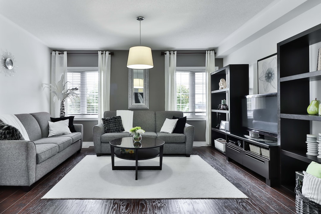
Paint colors that look perfect on the swatch and gorgeous in daytime sunlight can transform into something completely different once the sun goes down and artificial lighting takes over. This is one of the most common and frustrating surprises in home decorating, since most people choose paint colors during a daytime visit to the store or by holding a swatch up against a wall in the afternoon.
Here are ten paint color mistakes that don’t reveal themselves until nightfall.
Choosing a Color Based Only on a Small Swatch
A two-inch paint chip simply can’t show how a color will behave across an entire wall under different lighting conditions throughout the day and night. Colors intensify when applied at scale, so a subtle blue-gray swatch can read as noticeably more blue or more gray once it covers sixty square feet of wall space. Painting a large sample board or a section of actual wall and observing it under both natural daylight and your home’s evening lighting is the only reliable way to avoid this common and costly mistake.
Not Testing Under the Home’s Actual Light Bulbs
The color temperature of your light bulbs dramatically affects how paint reads once the sun sets, and a color tested only in a well-lit store or under different bulbs than the ones actually installed at home can look entirely different in practice. Warm-toned bulbs can pull out yellow and orange undertones in a paint color that weren’t obvious in daylight, while cooler bulbs can make the same color look flatter or grayer. Testing paint samples specifically under your home’s existing evening lighting setup, not just during a daytime visit, prevents this disconnect.
Underestimating Undertones in Neutral Colors
Neutral paint colors, especially whites, grays, and beiges, almost always carry a subtle undertone, whether it’s green, pink, blue, or yellow, and that undertone often becomes far more pronounced under artificial light than it is in daylight. A white that looks crisp and clean during the day can suddenly look slightly green or pink once the sun goes down, an effect that’s jarring precisely because it wasn’t visible when the color was chosen. Viewing paint swatches next to each other under evening lighting helps reveal these undertones before you commit to a full room.
Choosing Bold, Saturated Colors Without Considering Nighttime Intensity
Rich, saturated colors like deep navy, forest green, or bold red can look sophisticated and dramatic in natural light, but the same intensity can feel overwhelming or almost fluorescent under certain artificial lighting conditions at night. Saturated colors absorb and reflect light differently than muted tones, and some paint pigments interact with certain bulb types in ways that amplify their vibrancy well beyond what was intended. Testing bold color choices specifically in the evening, when the room is lit the way it will be most of the time it’s actually used, helps set realistic expectations.
Ignoring How North- or South-Facing Rooms Shift at Night
Rooms with different natural light exposures already interpret the same paint color differently during the day, and that variation carries into how artificial light interacts with the color after dark as well. A north-facing room, which tends to receive cooler, more diffused natural light, often needs a warmer paint color to avoid feeling cold, and that need becomes even more apparent under artificial lighting in the evening when there’s no natural light to balance it out. Choosing the same color across rooms with different orientations without accounting for this can lead to inconsistent results from room to room.
Overlooking Glossy Finishes That Amplify Artificial Light
Higher-sheen finishes like semi-gloss or high-gloss reflect more light than matte or eggshell finishes, which can be a beautiful effect in the right setting but can also create unexpected glare or hot spots under certain artificial lighting at night. A glossy accent wall that looks elegant in soft daylight can develop distracting reflections once overhead lighting or lamps are turned on in the evening. Considering the finish alongside the color itself, particularly in rooms with strong artificial lighting, helps avoid this often-overlooked mismatch.
Choosing Trendy Colors Without Longevity in Mind
Certain trendy paint colors are specifically formulated to photograph well in bright, evenly lit spaces for social media and marketing purposes, but they don’t always hold up as well under the mixed, changing lighting conditions of everyday home life after dark. A color that felt fresh and current when chosen can start to feel oddly artificial once you’re living with it under lamps and overhead fixtures every evening rather than in perfectly staged daylight photos. Choosing colors based on how they’ll actually be experienced day to day, rather than how they photograph, tends to hold up better over time.
Not Accounting for Adjacent Room Colors at Night
Open sightlines between rooms mean that paint colors don’t exist in isolation, and a color that seems fine on its own can clash or create an odd visual transition once artificial lighting is on in both spaces simultaneously in the evening. During the day, natural light can help unify adjacent spaces more than artificial lighting does, which is why color clashes between connected rooms often become more apparent specifically at night. Viewing paint choices in the context of neighboring rooms, under evening lighting conditions, helps catch these mismatches before a full repaint is complete.
Forgetting That Ceiling Color Affects the Whole Room at Night
Ceilings often get a default white or the same trim color throughout a home, but under warm artificial lighting at night, a stark white ceiling can look disconnected from the wall colors below it in a way that’s less noticeable during the day. This mismatch becomes especially apparent in rooms with warm-toned lighting, where the ceiling can take on a cooler, almost bluish cast in contrast to the walls. Considering how the ceiling color interacts with both the walls and the room’s typical evening lighting helps create a more cohesive look after dark.
Skipping a Full Day-to-Night Test Before Committing
The single most common mistake behind all of these issues is simply not testing a paint color across a full day-to-night cycle before committing to it for an entire room. Observing a sample patch first thing in the morning, at midday, in late afternoon, and after the sun sets, with your home’s actual lighting fixtures on, reveals far more about how a color will actually live in the space than any single viewing ever could. This extra step takes only a day or two but can prevent the far more expensive mistake of repainting an entire room after realizing the color doesn’t work once the sun goes down.
Leave a Reply