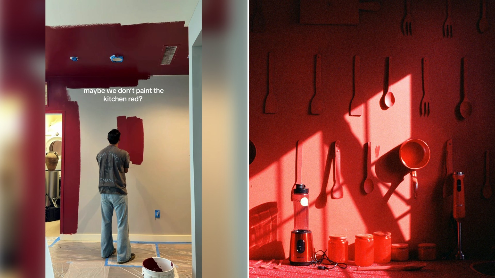
A creator debates whether to paint a kitchen and ceiling a deep red color, then goes ahead with the bold choice, documenting the labor-intensive painting process and the finished result, declaring “zero regrets” despite the risky color choice. It is the kind of clip that stops a scroll not because of a dramatic twist, but because of how ordinary its starting point is, right up until the moment everything changes on camera.
There’s a rawness to how the moment is captured, nothing about it reads as overly rehearsed, and that unpolished quality is a big part of why it plays as believable rather than performative. Viewers aren’t just being shown an outcome, they’re being walked through the process that produced it.
@donborsch 0 regrets by the way 😍 #kitchen #paint #interiors #apartment ♬ original sound – Luis Arturo
As @donborsch tells it, the story is grounded in specifics rather than generalities, and that groundedness is exactly what separates a clip like this one from the more staged, aspirational content that tends to circulate in the same corners of social media.
Deep red is one of the few paint colors that still reliably gets talked out of by a well-meaning friend, a paint store employee, or a renovation show host, which is part of what makes “zero regrets” such a pointed thing to say at the end. The caption isn’t just describing a finished room, it’s directly answering every version of the warning the creator presumably heard before picking up a roller.
Painting a ceiling the same deep red as the walls is a meaningfully bigger commitment than painting the walls alone, since a dark ceiling visually lowers a room and changes how light bounces around the space in a way four colored walls alone never would. That detail is easy to miss scrolling quickly, but it’s the choice that actually separates a bold accent wall from the much rarer full-room immersion this video shows.
Rental-specific content built around a dramatic paint choice occupies an unusual position, since most advice aimed at renters leans toward reversible, landlord-approved choices, neutral tones, removable wallpaper, things that won’t jeopardize a security deposit. A deep red kitchen and ceiling openly ignores that conventional wisdom, which is part of why it reads as a small act of rebellion against the usual renter playbook rather than just a design choice.
The labor-intensive nature of the painting process shown here matters more than it might first appear. Dark, saturated colors like deep red typically require multiple coats and a tinted primer to cover evenly, especially over a lighter existing wall color, so the drawn-out process documented in the clip isn’t incidental, it’s an accurate reflection of what a color this bold actually demands to look finished rather than streaky.
Comment sections under bold-color reveals like this one tend to split predictably: people who find the finished room genuinely striking, and people questioning how a renter plans to handle the color when the lease eventually ends. Both threads keep engagement going well past the initial view, since a dramatic color choice invites an opinion in a way a neutral repaint rarely does.
There’s also a practical reality renters face that owners don’t need to think about in the same way: most lease agreements require a tenant to either repaint back to a neutral color or forfeit part of a security deposit when they move out, which means a choice this dramatic carries a real, quantifiable cost down the line that the “zero regrets” declaration is implicitly choosing to accept now in exchange for living with a space that actually feels personal in the meantime.
For anyone sitting on their own bold color idea and getting talked out of it by the same kind of warnings this creator presumably faced, the video functions less as a design tutorial and more as a kind of permission slip, evidence that a color this saturated can actually read as intentional and striking rather than overwhelming, provided the coverage and finish are done properly.
Color psychology has its own specific take on why red in particular generates this much hesitation compared to other saturated hues. Red is strongly associated with appetite stimulation in restaurant design, which makes it a genuinely defensible choice for a kitchen specifically, even though the same intensity in a bedroom or living room would read very differently to most people walking in.
The soundtrack choice here, an original sound rather than a trending audio clip, signals something about how this particular video was built. Rather than chasing an algorithm-favored sound, the creator let the paint color and the finished reveal carry the clip on their own, which fits with the broader tone of quiet confidence running through the “zero regrets” framing.
There’s also a timing element worth noting in how a video like this one tends to land differently depending on when a viewer catches it. Someone scrolling past mid-renovation of their own space reacts to a finished, confident reveal very differently than someone who has never considered anything beyond a safe, neutral palette, and that gap in starting point is part of what makes the comment section split so predictably between admiration and skepticism.
However the story continues from here, the clip has already done what it set out to do: give viewers a genuine, specific look at a moment most people only ever imagine from the outside.
Leave a Reply