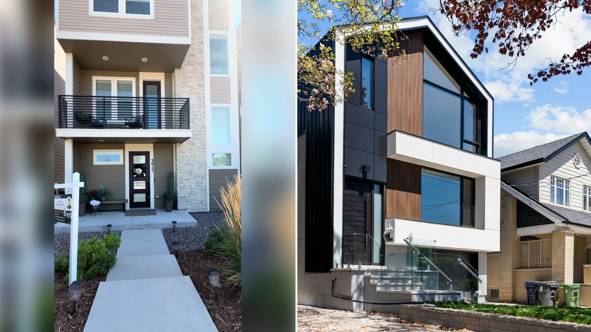
A real estate/interior design creator tours a three-story resale home, sharing candid opinions on its floor plan, decor choices, and storage solutions as she walks room to room. She points out specific design wins and shortcomings a typical buyer might miss. The video works less like a highlight reel and more like a short, honest documentary, the kind that earns its ending by actually showing the unglamorous steps that led there.
What sets this tour apart from a standard walkthrough is the running commentary itself, delivered room by room rather than saved for a single summary verdict at the end, so a viewer gets the designer’s reasoning in real time instead of a tidy conclusion handed down after the fact.
@ashley_nicole_interiors Unfiltered thoughts on this model home and Floorplan If you’re interested in more homes like these, contact @Denver Area Realtor-Mary Jane #ModelHomeTour #HomeWalkthrough #InteriorDesign #RealEstateReview #Homelnspiration ♬ original sound – Ashley Nicole
As @ashley_nicole_interiors frames it, there’s no attempt to smooth over the messier parts of the story, and that candor is a large part of why the post has resonated with people well beyond the creator’s usual audience.
What separates this walkthrough from a standard listing video is the willingness to actually criticize a home that’s still for sale. Most real estate content is built to flatter the property on screen, since the agent or the seller usually has a direct financial stake in how it comes across. A designer walking through and openly questioning a floor plan decision, with no listing commission riding on the outcome, gives the critique a credibility that a staged open-house tour rarely has.
Model homes in particular occupy a strange category in residential design, built less as someone’s actual future home and more as a showroom meant to sell an entire floor plan to dozens of future buyers at once. That origin shapes a lot of what ends up feeling slightly off about them, generic storage solutions sized for an average buyer rather than a specific family, decor chosen to photograph well rather than to live with daily, and layout choices that prioritize an impressive first impression over everyday functionality three years in.
A three-story layout adds its own specific set of tradeoffs that a single-level home never has to deal with, vertical circulation eating into square footage that could otherwise be living space, laundry rooms placed on the wrong floor relative to the bedrooms, and the simple physical reality of hauling groceries, luggage, or a vacuum up and down a full flight multiple times a day. Those are the kinds of friction points a thirty-second walkthrough can surface that a floor plan sketch on a listing page never communicates.
Comment sections under room-by-room critiques like this one tend to fill with people debating the specific decisions being questioned, some agreeing the storage solution doesn’t make sense for the space, others defending the builder’s choice as a reasonable tradeoff given the lot size or the price point. That disagreement is part of what keeps a critique video more engaging than a straightforward tour, since it invites viewers to form their own opinion rather than simply absorbing a sales pitch.
For buyers actually touring resale homes themselves, the real value in a video like this is less about the specific property and more about learning to ask the same kind of pointed questions during their own walkthroughs, whether a particular storage solution will actually hold what they own, whether a floor plan decision makes sense for daily life, and whether what reads as a design win on a quick tour will still feel that way five years into actually living there.
A real estate partner tagged directly in the caption also signals something about how this kind of content gets used in practice, not just as entertainment but as an actual marketing tool for a specific listing, where an honest, slightly critical take can build more trust with a prospective buyer than a purely promotional tour ever could.
There’s also something worth noting about the specific hashtag mix attached to the video, pairing broad terms like #InteriorDesign and #HomeWalkthrough with the more transactional #RealEstateReview. That combination suggests the creator is deliberately positioning herself at the intersection of two audiences that don’t always overlap, design-minded viewers who appreciate a critical eye for detail, and actively house-hunting viewers who want a second opinion before they book their own showing.
Interior designers who move into this kind of walkthrough content occupy a different role than either a real estate agent or a general lifestyle influencer. An agent’s incentive is almost always to help a specific sale close, while a designer narrating a tour has more freedom to point out a layout decision that simply doesn’t work, even in a home that’s actively listed, because her credibility depends on the critique being honest rather than on the property finding a buyer.
The three-story format of this particular home also shapes the kind of storage critique that tends to land with viewers. A single-level ranch forces every closet and cabinet onto one plane, which makes storage shortfalls obvious almost immediately, while a multi-story layout can hide an awkward storage decision on an upper floor that a buyer might not notice until they’re already living with it, carrying laundry up and down stairs for the first few months before the inconvenience fully registers.
Whatever this particular home sells for in the end, the walkthrough has already done something a staged listing photo set rarely manages: given a prospective buyer a genuinely critical, room-by-room sense of what it would actually be like to live there, floor plan quirks and all.
Leave a Reply