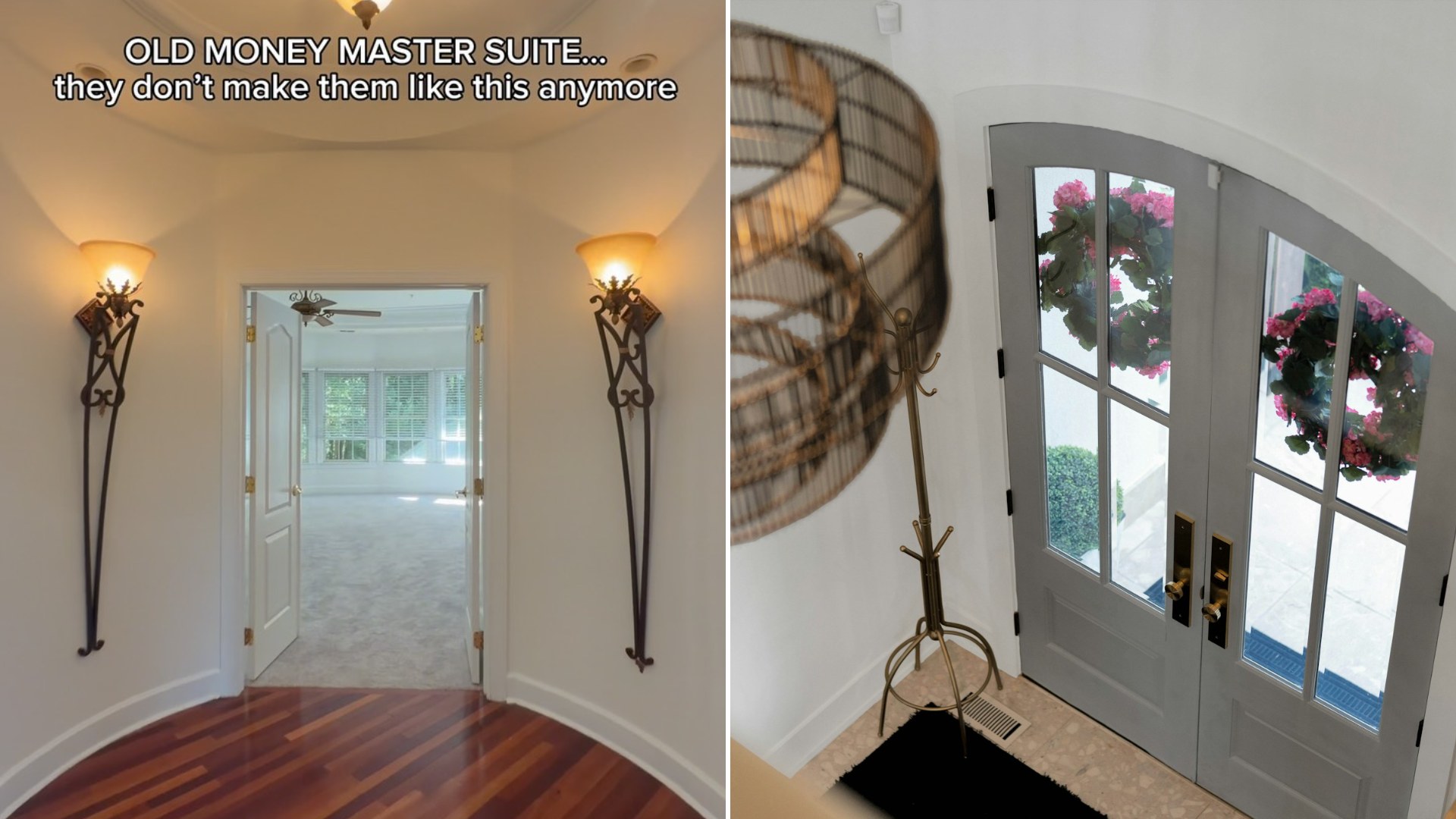
There’s a very particular feeling certain rooms give off, one that no amount of new construction seems able to replicate, and @theangelasaint (Instagram) captures it perfectly in a handheld walkthrough of what she calls the “old money master suite,” an expansive primary bedroom defined by architectural details simply absent from most homes being built today.
“Old money” has become something of a design shorthand online, less a literal reference to inherited wealth and more a descriptor for a specific set of qualities: solid millwork, generous proportions, high ceilings, and material choices that favor understated permanence over flashy trend-chasing. A primary suite that earns this label is signaling restraint and craftsmanship rather than conspicuous luxury.
Much of what reads as “old money architecture” actually comes down to construction economics from an earlier era. Decades ago, skilled plaster work, custom millwork, and generous room proportions were simply more affordable relative to labor costs than they are today, which means many of the details prized in older homes aren’t the product of unlimited budgets so much as a different economic reality for craftsmanship that no longer exists at scale.
It’s worth examining why new construction so rarely replicates this feeling, even in genuinely high-end builds. Modern construction optimizes for efficiency, standardized materials, faster build times, more predictable costs, all of which tend to produce cleaner, more minimal spaces almost by default. Recreating the layered, detail-rich architecture of an older primary suite requires deliberately working against those efficiencies, which most builders simply don’t have the time or budget to justify.
The call-to-comment structure of the video, inviting followers to ask for the listing and price, also reflects a savvy understanding of how desire works in real estate marketing. By letting the architecture do the emotional work first, the agent builds genuine investment before any price gets attached, turning what could be a simple listing video into something that functions more like a design showcase people actively want to engage with.
There’s a broader market trend underlying this kind of content too. As more buyers grow fatigued with the sameness of new-build subdivisions, open floor plans, identical trim packages, gray-on-gray palettes repeated from development to development, older homes with genuine architectural character have seen a real resurgence in desirability, even when they require more maintenance or updating than a comparable new build.
It’s worth thinking, too, about what specifically makes a primary suite feel substantial rather than simply large. Square footage alone doesn’t produce the effect this video captures, it comes from proportion, from ceiling height relative to room width, from the rhythm of windows and architectural detail, considerations that thoughtful architects understood deeply in earlier design eras and that are worth studying even for a modest renovation today.
For anyone renovating an older home rather than buying new, there’s an encouraging lesson buried in this tour: those original architectural bones, crown molding, generous window casings, solid doors, are worth preserving and restoring rather than stripping out in favor of a more contemporary look. The qualities that make a room feel like this one often can’t be added back in once they’re gone.
In the end, what resonates about this walkthrough isn’t nostalgia for wealth, it’s an appreciation for a kind of architectural confidence that simply takes more time and care to produce. Whether or not viewers ever see the listing price, the tour makes a compelling case that some design qualities are worth seeking out specifically, rather than assuming new construction can always deliver them.
Leave a Reply